Geographic View
Geographic View renders your live web application inventory on an interactive world map, placing each application at the physical location of the IP that serves it. It turns a flat asset list into a geographic picture of where your external attack surface actually lives — which countries, which hosting providers, and where the high-risk concentrations are.
Feature currently disabled
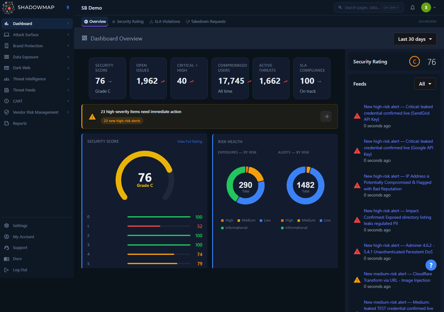
The /dashboard/geoview route is redirected to Overview in the current build — the map component is shipped but gated off at the router level, so navigating to the Geographic View URL lands you on the Overview dashboard instead. This page documents what the view renders from its data source so you understand the capability and the data behind it. The screenshot below is the Overview dashboard (the redirect target), not the map itself.
Overview
When enabled, the view is a single full-bleed map (CartoDB light basemap) with three layers:
- Application markers — one pulsing pin per live web application, placed at the latitude/longitude of its hosting IP. Marker color encodes the application's risk rating.
- Cluster pies — when markers are close together (or you zoom out), they collapse into a donut-shaped cluster. The donut is split into colored slices proportional to the application categories inside that cluster, with the total count printed in the center.
- A category legend — a collapsible panel (bottom of the map) listing every application category present in your data, each with a live count. A Show Legend / Hide Legend control toggles it.
The map opens centered on a wide world view and then auto-fits its bounds to wherever your applications actually are, so you immediately see your real footprint rather than an empty globe. Hovering a country highlights its border.
How it works
The mechanics below are not visible in the UI — they determine which assets appear, where they land, and how they are colored and grouped.
What gets plotted
The map is populated from a single request to GET /dashboard/geomap_data, which returns a GeoJSON FeatureCollection. Each feature is one web application from your inventory. The underlying query (fetchOpenApplicationsForCompany) selects every application for your company whose status is not Closed — i.e. the same live web-application universe you see in Web Applications — and orders them by risk, highest first.
Two filters silently shape what you see:
- Closed applications are excluded. Anything ShadowMap has retired (no longer responding, decommissioned) does not appear on the map. The map reflects your current live surface, not historical assets.
- Applications without a resolved geolocation are skipped. Each marker requires a
geolocation_id— the result of resolving the hosting IP to a latitude/longitude. If an application's IP has not been geo-located (for example a brand-new finding still being enriched, or an IP that geo-IP lookup could not place), that application is omitted from the map even though it is live. This is the most common reason the map shows fewer assets than the Web Applications list.
Geolocation is IP-based, not ownership-based
A marker's position is the physical location of the server IP as reported by IP geolocation, not where your company is headquartered. An application "in Germany" means it is served from an IP that geolocates to Germany — typically your CDN edge, cloud region, or hosting provider's datacenter. This is exactly what you want for attack-surface mapping: it shows where an attacker would actually reach the service.
How markers are colored (risk)
Each feature carries the application's calculated risk rating (emitted as the risk property, sourced from the application's risk_text), and the marker color maps directly to it:
| Risk | Marker color |
|---|---|
| High | Red |
| Medium | Orange |
| Low | Yellow |
| Informational / none | Green |
A cluster of red pins in one region is a direct visual signal that a hosting location or provider concentrates your riskiest exposure.
How clusters are built (category)
When markers overlap, ShadowMap groups them into a single cluster pie instead of stacking pins. The donut is divided by application category — each colored slice is one category, sized by how many applications of that category fall inside the cluster, and the number in the middle is the total application count for that cluster. Zooming in splits clusters apart until individual markers separate out.
Category is derived from each application's classified type via a fixed rule set. The recognized categories are:
| Category | What it represents |
|---|---|
| Internal Admin | An admin interface flagged as internal-facing |
| Admin | An administrative interface / control panel |
| Internal Login | An internal application presenting a login or password prompt |
| Internal | An application classified as internal-facing |
| Login | A login or password-protected page |
| Amazon S3 Bucket | An exposed Amazon S3 bucket endpoint |
| At Risk | An application classified as high-risk |
| Default Page | A default / placeholder server page (e.g. unconfigured web server) |
| Parked | A parked domain |
| Third Party Apps | A recognized standard third-party application |
| Forbidden | A resource returning a forbidden response |
| Blank | A blank response |
| Dynamic | Virtual-host, open-app, message, or not-found style responses |
| Others | Anything that matches none of the above |
The legend lists exactly these categories with their counts for your data, so the legend doubles as a quick inventory breakdown ("you have 4,775 Login apps, 2,018 Admin apps…") even before you read the map.
What clicking a marker does
Clicking an individual application marker navigates straight to that application's detail page in the Attack Surface module:
/attack-surface-area/web-applications/application/{id}/detailsSo the map is also a navigation surface — spot a red pin in an unexpected country, click it, and you are on the full finding for that web application (ports, headers, screenshots, tags, status, and history).
Refresh cadence
The map is built on demand from your current application inventory each time it loads — there is no separate map cache. It therefore reflects the same data freshness as the rest of your web-application inventory, which is updated by ShadowMap's recurring scans. New applications appear once they are discovered and their hosting IP has been geo-located.
Reading the map
A practical workflow for a security professional:
- Scan for red clusters. High-risk concentrations by region tell you where your worst exposure is hosted. A red-heavy cluster over a region you do not expect to operate in is worth investigating immediately.
- Check for unexpected geographies. Markers in countries where you have no infrastructure can indicate shadow IT, a misconfigured CDN/origin, a third-party vendor hosting on your brand, or an impersonation. Cross-reference suspicious hosts with Phishing URLs.
- Use the legend as a census. The category counts give you a fast inventory profile — e.g. how many login/admin surfaces you expose externally. A large Admin or Internal Login count visible on the public internet is a finding in itself.
- Drill in. Click any marker to open the full web-application detail and triage from there.
Common questions
The map shows fewer applications than my Web Applications list. Why? Two reasons. First, the map excludes Closed applications, so retired assets are not plotted. Second, and most often, applications whose hosting IP has not yet been geo-located are skipped — they have no coordinates to plot. As enrichment resolves those IPs, the applications appear on the next load.
An application is plotted in a country where I don't operate. Is that wrong? Not necessarily. The marker sits at the geolocation of the serving IP, which is frequently a CDN edge node or a cloud region rather than your office. That said, a marker in an unexpected location can also be a legitimate finding — shadow IT, a third-party host using your brand, or an origin server you did not know was internet-facing. Click the marker to inspect the host and confirm whether you own it.
What do the colors mean? Marker color is the application's risk rating: red = High, orange = Medium, yellow = Low, green = Informational/none. In a cluster, the donut slices are colored by application category, not risk, and the center number is the count of applications in that cluster.
I went to the Geographic View URL and got the Overview dashboard. That is expected in the current build. The /dashboard/geoview route is redirected to Overview; the map component is present in the codebase but disabled at the router level. Use the Overview dashboard and the Web Applications inventory for the same data in the meantime.
Can I export the map or filter it? No. The Geographic View is a read-only visualization with no export, search box, or column filters of its own. To filter, sort, or export the same applications, use the Web Applications inventory, which is built from the same live (non-Closed) application set.
Related
- Web Applications — the same live application inventory the map is built from, with full filtering, columns, status workflow, and export. Marker clicks land here.
- Overview — the dashboard the Geographic View URL currently redirects to.
- Security Rating — the company-level risk score that the high/medium/low risk ratings on these applications feed into.
- WHOIS & Geolocation — background on how ShadowMap resolves hosting IPs to providers, netblocks, and physical location (the data that places each marker).