Dashboard Overview
The Dashboard Overview is the first screen you land on after login (/ and /dashboard both redirect here). It rolls up your entire external attack surface — exposures, alerts, dark-web exposure, brand abuse, data leaks, and threat intelligence — into a single scrollable page built for a 30-second posture read, with one-click drill-downs into every underlying module.
Overview
The page is a vertical stack of cards, with a live activity feed pinned to the right:
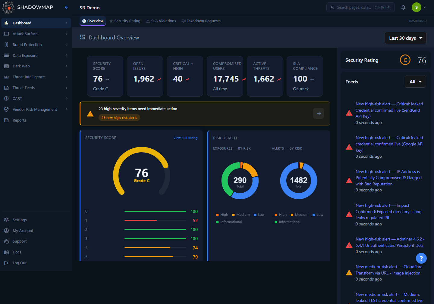
- Hero metrics strip — six headline KPIs across the top (Security Score, Open Issues, Critical + High, Compromised Users, Active Threats, SLA Compliance).
- Action Required banner — appears only when critical/high findings exist; jumps you straight to the worst items.
- Security Score (gauge + per-category breakdown) and Risk Health (exposure/alert donuts) side by side.
- Recent Findings — a prioritized, severity-grouped feed of what changed recently across all modules.
- SLA Violations and Status by Action (alert response workflow) side by side.
- Detection Coverage — a per-module health matrix (open/closed counts and trend per module).
- Historical Trend (open vs. closed over time) and Tracked Actors (threat-intel actor activity) side by side.
- Feeds sidebar — the running stream of new findings, plus a compact Security Rating badge.
A time-range dropdown in the page header (top right) offers Last 7 days, Last 30 days (default), Last 90 days, and All time. The selection is saved to your browser, so the dashboard remembers it between sessions.
Who sees what
The Detection Coverage matrix requires the dashboard.executive-summary:read permission. If your role lacks it, that section stays empty while the rest of the dashboard renders normally. Every drill-down link also respects per-module permissions — you only reach modules you can access.
How it works
The dashboard makes roughly seven parallel API calls on load (and again whenever you change the time range). Each card loads and fails independently — a broken widget shows an empty state rather than blanking the page. Here are the mechanics you can't see from the UI.
Where each hero number comes from
The six hero metrics are deliberately sourced from disjoint backend tables so nothing is double-counted:
| Metric | How it's calculated | Source |
|---|---|---|
| Security Score | Pre-computed overall rating (0–100) with a letter grade. Shows — if no rating has been computed yet. | Security Ratings (finalScore) |
| Open Issues | new + open exposures plus new + open alerts. "New" = created in the last 7 days; "Open" = status is Open/Reopened. | Applications table + Alerts table |
| Critical + High | Sum of high-severity counts from both exposures and alerts (severity breakdowns of the two separate tables, not duplicates). | Applications + Alerts |
| Compromised Users | Total credentials/users found in stealer-log infections. Labelled "All time". | Stealer Logs table |
| Active Threats | new + open alerts only. | Alerts table |
| SLA Compliance | (all − open) / all, rounded to a percentage (see below). Defaults to 100% when there are no violations. | Open SLA Violations |
"Compromised Users" is all-time, not windowed
The hero Compromised Users card is a tenant-wide, all-time total pulled straight from the stealer-logs widget — it deliberately ignores the date-range dropdown. The Dark Web Overview shows a time-windowed count for the same data, so the two surfaces can legitimately differ (e.g. 45,533 all-time vs. 674 in the selected window). The "All time" subtitle on the card is there to make that reconcilable at a glance. See Dark Web Overview.
The date range doesn't drive everything
The hero exposure/alert/stealer widgets use scan-session-based windows baked into the backend (typically the last 7 days for exposures, or the last scan window for alerts) — they don't currently honour the date-range dropdown. The dropdown primarily drives the Detection Coverage matrix, the Feeds, and the detail widgets. Treat the hero strip as a "current state" snapshot and the matrix/feeds as the range-filtered view.
Security Score and grades
The Security Score gauge shows your overall rating out of 100. The grade and its colour come from fixed thresholds, and the same scale is used for each module bar underneath the gauge:
| Score | Grade | Colour |
|---|---|---|
| 90–100 | A | Green |
| 80–89 | B | Lime |
| 70–79 | C | Yellow |
| 60–69 | D | Orange |
| 0–59 | F | Red |
The bars below the gauge break the score down by category (e.g. Attack Surface, Dark Web, Brand Protection) so you can see which area is dragging the overall number down. View Full Rating in the card header opens the Security Rating page for the full methodology and factor-level detail.
A blank score means "not computed", not "F 0"
If a rating hasn't been computed for your tenant yet, the score renders as — (and the sidebar badge shows a muted dash), not an "F 0". A real failing grade only appears when there is a genuine zero score behind it.
SLA Compliance math
SLA compliance is derived from the open SLA-violation count:
compliance % = round( (open + closed − open) / (open + closed) × 100 )The backend returns the open violation count (the total field) plus a short Top Violators list. If there are zero violations, compliance shows 100%. Below 90%, the hero card flips to "Needs attention"; at or above 90% it reads "On track". View All opens the full SLA Violations list.
Risk Health donuts are click-to-filter
The two donuts (Exposures by Risk, Alerts by Risk) break current items into High / Medium / Low / Informational, with the live total in the centre. Clicking a slice navigates you to the corresponding list pre-filtered to that risk band:
- Exposures donut → Web Applications, filtered to
status IN (New, Open, Reopened) AND risk = <slice>. - Alerts donut → Alerts (Needs Review), filtered to
risk = <slice>.
Status by Action (alert response workflow)
This card mirrors the four working tabs of the Alerts list so the numbers line up exactly:
| Stage | Meaning |
|---|---|
| Needs Review | Alert is open and nobody has triaged it yet. |
| Investigating | Someone has picked it up and is working it. |
| Accepted Risk | Reviewed and consciously accepted (not remediated). |
| Closed | Resolved / no longer relevant. |
The bar underneath shows the proportional split across the four stages.
Detection Coverage matrix
The matrix is a single batch call (/dashboard/executive-summary/batch) that replaces what used to be 20+ individual widgets. Each card shows a module's Open and Closed counts plus a trend percentage. Per EASM semantics, more items is bad: an upward trend renders red, a downward trend green. Only modules with a non-zero count are shown — empty modules are hidden to keep the grid scannable. Each card links to that module's list page.
Modules in the matrix, grouped by category:
| Category | Modules |
|---|---|
| Attack Surface (blue) | Web Applications, Network Services, SSO, JS Trackers |
| Alerts (orange) | Alerts |
| Dark Web (red) | Compromised Users / Cookies / Autofills / Cards / Wallets / Tokens, Browser History, Data Breaches, Discussions |
| Brand Protection (purple) | Phishing, Domain Squatting, Fake Applications |
| Data Leaks (cyan) | Code Repositories, Leaked Files, Leaked APIs, Docker Containers, S3 Buckets |
| Threat Intelligence (green) | News Feeds |
Dark-web "Compromised *" cards intentionally show Open only (no Closed column), since those findings are evidence of compromise rather than a workflow you close out.
Recent Findings feed
Recent Findings aggregates findings from 13+ module repositories into one prioritized, severity-grouped list. Each row is a group (e.g. "5 new high-risk alerts") with a severity icon, a count, a category label, and a drill-through arrow. Groups with more than two items can be expanded in place to preview the individual findings (each with its own risk letter). A summary bar at the top tallies Critical / High / Medium when multiple severities are present. When there's nothing new, the card shows an "All Clear" state. The subtitle reads N in last X days, reflecting the feed's own time window.
Action Required banner
When the findings feed contains critical or high severity groups, a banner surfaces above everything else with up to five clickable chips (one per finding group) and a total count. If any item is critical the banner turns red; otherwise it's amber. Each chip — and the arrow button — deep-links into the relevant module list. The banner is purely derived from Recent Findings; it disappears entirely when there's nothing critical or high outstanding.
Tracked Actors and Historical Trend
- Tracked Actors lists up to five threat actors you're tracking, with origin/country and (where known) campaign or motivation, plus a relative "last active" timestamp. It's empty until you start tracking actors. View Threat Intelligence opens the Threat Intelligence Overview.
- Historical Trend plots Open (red) vs. Closed (green) item counts over time so you can answer "are we getting better or worse?" The chart is empty until enough history has accumulated.
Feeds sidebar
The right-hand sidebar streams new findings as they're detected — each item has a module icon, a title that links to the source, and a relative timestamp. A multi-select filter narrows the stream by category: Attack Surface, Alerts, Dark Web, Brand Protection, Data Leaks, Threat Intelligence. The feed paginates as you scroll. Above it sits a compact Security Rating badge (grade + score) that mirrors the gauge.
Reading the dashboard
A practical top-to-bottom triage when you open the page:
- Action Required banner (if present) — the single highest-priority thing to look at. Click a chip to go straight to it.
- Hero strip — is the Security Score where you expect? Are Critical + High and Active Threats trending the wrong way?
- Risk Health donuts — click the High slice on either donut to jump into the high-risk exposures/alerts.
- Recent Findings — scan the severity-grouped feed for anything new; expand a group to preview before drilling in.
- SLA Violations / Status by Action — confirm nothing is breaching SLA and that open alerts are actually being worked, not piling up in Needs Review.
- Detection Coverage — spot any module trending red (growing) and drill into it.
Common questions
My Security Score shows "—" instead of a number. Is something broken? No. A dash means no rating has been computed for your tenant yet (common on brand-new accounts or POCs before the first full scan completes). It is deliberately not shown as "F 0" so a missing rating can't be mistaken for a catastrophic one. The number appears once scan data is available.
The "Compromised Users" number here is much higher than on the Dark Web Overview. Which is right? Both are correct — they measure different windows. The Dashboard hero card is an all-time, tenant-wide total (hence the "All time" caption). The Dark Web Overview applies a time window. Use the Dashboard figure for total exposure and the Dark Web Overview for recent activity.
I changed the time range but the hero metrics didn't move. Expected. The hero exposure/alert/stealer widgets run on fixed scan-session windows and don't follow the date-range dropdown. The dropdown drives the Detection Coverage matrix, the Feeds, and detail widgets. Use the relevant module list page if you need a fully custom date filter.
The Detection Coverage matrix is empty for me. That section requires the dashboard.executive-summary:read permission. If your role doesn't include it, the matrix stays blank while everything else loads. Ask an administrator to grant the permission, or use the per-module list pages directly.
Why do some Dark Web modules show only an "Open" count? The "Compromised *" findings (cards, cookies, tokens, etc.) represent evidence of compromise, not a triage workflow you close out, so they intentionally omit a Closed column.
A finding group in Recent Findings won't expand. Only groups with more than two items expose the expand control. Groups of one or two items go straight to the module list when clicked.
Clicking a donut slice took me to a filtered list — can I clear that filter? Yes. The risk filter is applied via the URL query on the destination list page; clear it there (or remove the filter chip) to see the unfiltered list.
Related
- Security Rating — the full methodology behind the Security Score gauge and the per-category breakdown.
- SLA Violations — the list the SLA card and "View All" link open.
- Alerts — destination for the Alerts donut and the Status by Action stages; its tabs match the response workflow shown here.
- Web Applications — destination for the Exposures donut and the Web Applications matrix card.
- Dark Web Overview — the time-windowed counterpart for the Compromised Users metric.
- Threat Intelligence Overview — the source of the Tracked Actors card.