How the Score is Calculated
Your Security Rating is a single 0–100 number and an A–F letter grade that summarizes your externally observable security posture. This page explains exactly how that number is produced: what each category measures, how a category earns its score, how the categories combine into the overall rating, and how often the whole thing updates.
Overview
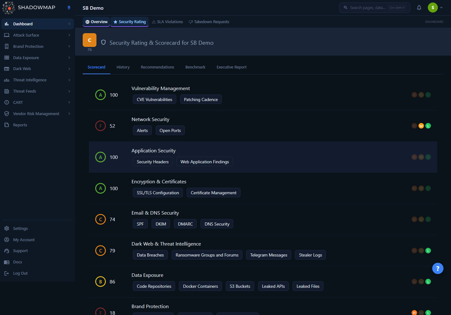
The Scorecard tab is where the rating is made legible. The large header score is your overall rating; below it, each row is one category with its own score, grade, the sub-modules that feed it, and three risk-indicator dots (High / Medium / Low) showing whether that category currently has active findings at each severity. Every score you see — the header, each category, the History trend, the Benchmark ranking — is derived from the same per-category data described below.
Where the numbers come from
The dashboard does not run the scan-level math in the browser. ShadowMap's scanning backend evaluates your attack surface, writes one scored row per category, per scan day into the rating store, and the dashboard reads those rows. The dashboard's job is to average the categories into the overall score, assign grades, and render trends and attribution. So "how a category score is computed" (severity, recency, findings) happens upstream; "how categories become one rating" happens here, and is fully transparent.
How it works
The overall score is an equal-weighted average of your category scores
This is the single most important — and most misunderstood — fact about the rating. The overall score is the plain arithmetic mean of your category scores, rounded to the nearest integer:
overall_score = round( sum(category_scores) / number_of_categories )There is no category weighting in the dashboard rating: every scored category contributes equally to the average. A category that has no findings still contributes its (typically high) score and pulls the average up; a category in poor shape pulls it down by exactly its share. This formula is applied identically on the server and in the browser, so the header card, the right-panel widget, and the Overall score on the dashboard overview always agree.
Why your overall score can look "better than your worst category"
Because the categories are averaged, one category sitting at an F does not drag the whole rating to an F. If seven categories are at 90 and one is at 40, your overall is (90×7 + 40) / 8 ≈ 84 — a B. Use the per-category rows, not just the header number, to find where the real risk is. The header tells you your average posture; the rows tell you your weakest link.
How a single category earns its score
Each category score (0–100) is produced upstream by the scoring engine from the findings ShadowMap collected for that category. The engine applies three principles, in order of how much they move the number:
| Principle | What it means |
|---|---|
| Severity matters | A Critical finding weighs far more than a Low one. Severity is the dominant input — a single high-severity exposure moves a category score more than a large pile of low-severity noise. |
| Recency matters | Recent findings count more than old ones. A finding that first appeared this week has full weight; an aging, never-actioned finding loses weight over time so the score reflects current exposure, not history. |
| Remediation matters | Findings you have actioned (closed/resolved) stop dragging the score down. The store tracks open and closed counts per severity for every category, so closing findings is the direct lever on a category score. |
Each category row carries the raw material for this in the data the dashboard receives: open counts and closed counts at High / Medium / Low, a total finding count, and the risk bands that drive the History chart. The three dots on each Scorecard row are lit when that severity band has active (open) findings and dimmed when it does not — hover a dot to see the exact count.
The per-category weighting is set by the scanner, not the dashboard
The exact severity multipliers and recency curve live in the scoring engine, not in the dashboard, and may be tuned over time. The dashboard faithfully renders whatever per-category score the engine writes. What the dashboard guarantees and what this page documents precisely is the averaging, the grade bands, and the update cadence — everything between the category scores and the number on your screen.
Grade bands
The same five bands are applied to the overall score, to each category score, and to benchmark scores. Higher is better.
| Grade | Score range | Interpretation |
|---|---|---|
| A | 90–100 | Excellent. Minimal externally visible risk. |
| B | 80–89 | Good. Some improvements recommended, no critical gaps. |
| C | 70–79 | Fair. Meaningful gaps that should be addressed. |
| D | 60–69 | Poor. Significant risk requiring prompt attention. |
| F | 0–59 | Critical. Severe, unacceptable exposure. |
These bands are exact and consistent everywhere a grade appears — the header pill, the per-category badges, the colored bars in Benchmark, the bar labels in the Score Trend chart, and the grade filter on the VRM vendor list all use this table.
How often the score updates
Scores are recalculated when scans complete, not on a fixed clock you control. Scanning runs on a cadence of every few hours per source, and each completed scan writes fresh per-category rows. The dashboard then serves the latest day's rows, with a 10-minute server-side cache so that everyone in your organization sees the same authoritative number and repeated page loads don't re-query. In practice:
- The score you see is always the latest scored day on record.
- A change you make (closing findings, fixing a misconfiguration) shows up after the next scan picks it up — typically the same day, not instantly.
- If the cached value looks stale immediately after a big remediation, it will refresh within ~10 minutes and fully reflect the change on the next scan cycle.
Understanding the Scorecard
Each category row on the Scorecard exposes four things:
| Element | What it shows |
|---|---|
| Grade + score | The category's letter grade and its 0–100 score, colored by band. |
| Category name | The security domain being measured (e.g. Vulnerability Management, Dark Web). |
| Sub-module chips | The specific modules feeding this category (e.g. Open Ports, CVE Vulnerabilities, Code Repositories). Chips that map to a list module are clickable and jump straight to those findings. |
| Risk dots (H / M / L) | Lit when the category has open findings at that severity; dimmed when it does not. Hover for the exact count. |
The sub-module chips are the fastest path from "this category scored low" to "here is exactly what's wrong." For example, a low Vulnerability Management score links to the Vulnerability Overview; a low Network Security score links to Open Ports and Alerts; a low Data Exposure score links to Code Repositories, S3 Buckets, and related modules. Email/DNS posture factors (SPF, DKIM, DMARC) appear as labels but are not yet a standalone list module, so they render as plain text.
What feeds each category
The categories on your Scorecard group ShadowMap's modules by the kind of risk they represent. The exact set and naming can evolve, but the mapping the Scorecard uses is:
| Category | Representative sub-modules |
|---|---|
| Vulnerability Management | CVE Vulnerabilities, Patching Cadence |
| Network Security | Open Ports, Alerts |
| Application Security | Security Headers, Web Application Findings |
| Encryption & Certificates | SSL/TLS Configuration, Certificate Management |
| Data Exposure | Code Repositories, Docker Containers, S3 Buckets, Leaked APIs, Leaked Files |
| Dark Web & Threat Intelligence | Data Breaches, Stealer Logs, Ransomware Groups & Forums, Telegram Messages |
| Brand Protection | Fake Applications, Phishing URLs, Domain Squatting |
| Email & DNS Security | SPF / DKIM / DMARC coverage, DNS security (informational; no list module) |
The History tab: trend and attribution
The History tab renders two charts over a rolling 7-day window (page back/forward a week at a time):
- Risk Trend — a line chart of High / Medium / Low finding counts per day, so you can see whether new exposure is accumulating.
- Score Trend — a bar chart of the daily overall score, each bar labeled and colored by grade.
Behind these, the rating store keeps score-change attribution. For each category it compares the latest score on each day against the prior day and records a human-readable summary — for example "Network Security declined by 4 points (12 new findings)" or "Data Exposure improved by 6 points (3 findings resolved)." Changes smaller than half a point are ignored as noise, and only the latest score per category per day is used so a manual re-scan can't produce contradictory "improved / declined" entries for the same day. This is what makes a score change explainable rather than mysterious: every move is tied to a category and a finding count.
Recommendations
The Recommendations tab turns the scoring into a prioritized work queue. Each recommendation is generated from your findings and carries:
- a priority rank (the list is ordered by priority, most important first),
- a severity (Critical / High / Medium / Low) and the category it belongs to,
- an affected count (how many findings it covers, shown as N findings),
- an estimated score impact (e.g. +5 pts — the approximate gain from resolving it, also drawn as an "estimated score improvement" bar), and
- a View findings link to the backing module where one applies.
Because the overall score is an average of categories, the estimated impact is largest for recommendations in your lower-scoring categories — fixing a category that is already an A barely moves the needle, while lifting an F category lifts the whole average. The list shows up to the top 20 open items; you can dismiss a recommendation you don't intend to action, which removes it from the list.
Benchmark
The Benchmark tab ranks your organization against other orgs you add (up to five). Each org's score there is the average of its category scores — the same equal-weighted formula as your own overall score — and each is shown with a per-category breakdown bar so you can see which categories drive a competitor's lead or lag, not just the headline number.
Common questions
My overall score is a B, but I can see an F category. Is the rating wrong? No — this is by design. The overall score is the average of all your category scores, so a single weak category is diluted by the others. The rating is telling you your average posture; the F category is telling you your weakest posture. Both are true. Act on the low category rows, not just the header number.
My score dropped overnight and I didn't change anything. Why? A score moves whenever a completed scan changes a category's findings — new exposures appearing matters as much as old ones being fixed. Open the History tab: the score-change attribution names the exact category and finding count behind the move (e.g. "12 new findings"). New CVEs being published against software you already run, a newly leaked credential, or a certificate slipping toward expiry will all lower a category without any action on your part.
I fixed a problem hours ago but the score hasn't moved. Two delays apply. The score only updates when the next scan re-observes your surface and confirms the finding is gone, and the dashboard caches the result for up to 10 minutes. After the next scan cycle picks up your fix, the relevant category — and therefore the average — will reflect it.
Which fix will raise my overall score the most? Target your lowest-scoring categories, because the overall score is an average: pulling a 40 up to a 70 adds far more to the average than pulling a 90 up to a 95. The Recommendations tab does this math for you with an estimated score impact per item, sorted most-impactful first.
How is a category score itself calculated? By the scoring engine, from that category's findings, weighted by severity (Critical ≫ Low), recency (recent findings count more), and remediation (closed findings stop counting against you). The dashboard renders that score and the open/closed counts per severity, but the precise multipliers are owned and tuned by the scanning backend, not the dashboard.
Do all categories count equally toward the overall score? Yes. The dashboard rating is a plain, unweighted average of category scores. (Severity weighting happens inside each category, not between categories.)
What's the difference between the score on the header and the score in the right-side widget? Nothing — they are the same server-computed value, returned as an authoritative finalScore so the two bindings can never drift apart, even if a local cache is briefly out of date.
Related
- Security Rating overview — the Scorecard, History, Benchmark, Recommendations, and Executive Report tabs in full.
- Improving Your Score — practical, category-by-category remediation guidance.
- Benchmarking — how peer comparison is built and read.
- Vulnerability Overview — the Vulnerability Management category's underlying findings.
- Vendor Risk Management — the same rating methodology applied to your third-party vendors.